Google Fiber Case Study
Reducing Repeat Calls w/ Strategic BI Insights

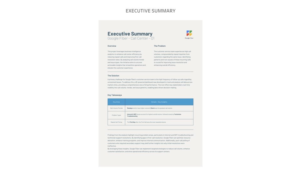
This project was completed as part of a BI analyst hiring assessment for Google Fiber. The primary objective was to analyze fictionalized call center data to identify patterns in repeat customer service calls and provide insights to reduce repeat call volume.
The business goal?
Improve first-call resolution, enhance customer satisfaction, and optimize operational performance.
Tools Used
To complete the analysis, I used:
SQL/Excel/Power Query: Data cleaning, wrangling, and shaping in preparation for visualization
Tableau: Data visualization and stakeholder storytelling
Project Scope & Stakeholder Needs
Before diving into the project, I aligned with stakeholder expectations from a simulated internal team: hiring managers, project managers, and BI leads.
Their core question was:
"How often are customers repeatedly contacting customer service, and what are the underlying drivers?"
The leaders needed help gaining insights on the data they had accumulated including:
Visibility by market (three anonymized service areas)
Breakdown by issue type (account, technician, scheduling, construction, and internet/Wi-Fi)
Trend analysis (week/month/quarter granularity)
Clear storytelling around which issue types or markets were high-impact
I started by digging into a dataset, I wanted to understand which issues were most commonly associated with repeat contacts and whether there were any glaring patterns tied to geography and/or service category.
Data Familiarization & Assumptions
I identified key variables in which were discussed with the team, I knew there would be some need for extraction of some elements based on call dates and the repeat calls from customers. In the data I assigned elements needed for analysis including formatting to dates:
contact_n as the first call
contactn6, etc. as repeat calls (“_x” days later as the delineator)
Type_1–Type_5 - call issue types
market_1–market_3 - location proxies
I made changes to structure the data meaningfully (e.g., contact columns represent escalating contact days), and used SQL initially and then Excel/Power Query to view and prep it for visual analysis.
Building the Dashboard
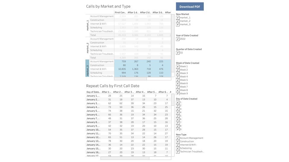
Once I had a clear grasp of the data, I built an interactive Tableau dashboard that allowed stakeholders to explore trends of the repeated calls.
I created a multi-tab dashboard that featured:
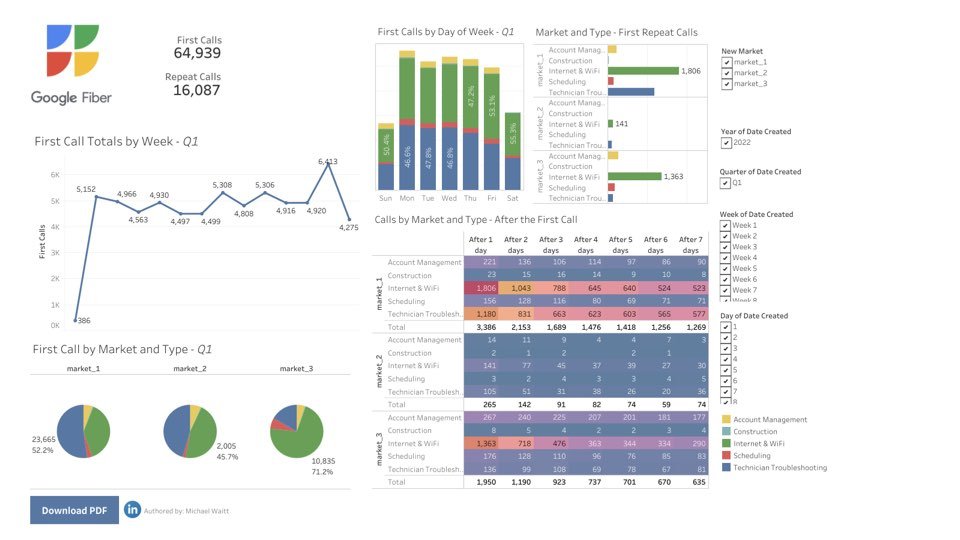
Repeat Calls by First Contact Date (Table)
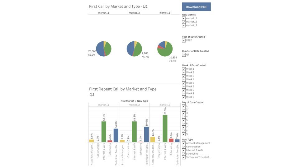
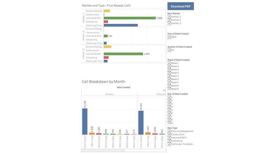
Market + Problem Type Breakdown (Bar Chart)
Calls by Market and Type (Table)
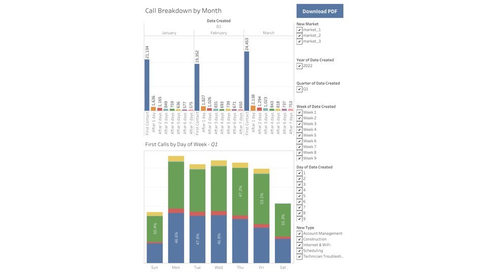
Weekly/Monthly/Quarterly Trends (Bar Chart w/ filter)
Each visualization was designed to allow stakeholder drill-down for insights, including:
Dynamic filters
Time-based trends
Comparative analysis between markets
Each tab in the dashboard is designed to support a different layer of analysis—from high-level summaries to detailed breakdowns by market and issue type allowing a dynamic overview of the provided dataset.
Translating Data Into Action
The next step was communicating my findings back to the stakeholders in a way that would be clear and useful to non-technical users.
The dashboard uncovered meaningful patterns including:
Internet & Wi-Fi issues (Type_5) consistently triggered the highest volume of repeat calls.
Market 1 had the greatest concentration of these issues, suggesting a need for targeted improvement.
Scheduling issues (Type_3) showed fewer repeats—indicating better resolution protocols or expectations set.
and paired them with strategic recommendations, including:
Roll out targeted support training in high-repeat categories (Type_5 in Market 1)
Enhance self-service tools (e.g., FAQ articles or chatbot prompts)
Monitor first-call resolution rate KPIs alongside repeat volume to track future improvements
Stakeholder Alignment & Accessibility
I ensured my dashboard:
Was accessible (text alternatives, large font, screen-reader compatible)
Followed privacy standards (using pre-anonymized data)
Was scoped for six-week delivery with clear documentation
Could be shared as a read-only Tableau Public link for visibility without editing permissions
This project delivered more than just a report—it provided a foundation for real operational improvements. It allows for data expansion and to stay relevant with the needs of the customer service team and their clients.
This dashboard or one similarly aligned to your business’s goals can be an essential tool for evaluating support for team performance and identifying areas for training and service enhancements.